
#Internship
#Healthcare
#Web-app
Supporting parents & infants who deserve peak comfort for their bottoms.
I joined Huggies to work closely with a cross-functional team on user research and early experience design, contributing to an interactive diaper rash care tool that helps parents confidently assess and treat their baby’s condition. Together, we focused on improving clarity, confidence, and trust during an emotionally sensitive moment for parents.
TIMELINE
5 months
TEAM
1 Senior UX Reseacher
1 UX Design Intern
MY ROLE
UX Research & Design
TOOLS
Figma,
FigJam, FullStory, UserTesting, Microsoft Teams
DELIVERABLES
User Growth
~20%
increase target acquisition for parents
Adoption Rate
100%
parents recommended the new tested tool
Survey Results
~100+
Parents from all background loved testing out the new tool
CONTEXT
1 in 2 infants will develop diaper rash in their life time
When parents noticed a diaper rash, they turned to the internet for clarity. Despite Huggies’ educational library, many struggled to find guidance that felt clear and relevant.

Credit: Mayo Clinic, Clevend Clinic
RESEARCH APPROACH
In our survey,
75% of first time parents reported feeling unsure
on how to treat their child's diaper rash
Partnering with a Senior UX Researcher, I mapped their journey from first concern to resolution through research.
Surveyed 100+ parents
We wanted to understand parent's behaviors, pain points, and patterns across demographics.
15 in-depth interviews
We asked parents from low-income background to map their emotional journey and decision-making process.
Testing & Iterations
We conducted usability testing and A/B tests to validate concepts and refine the solution.
PROBLEM
The real challenge isn't treatment, it's accurate information and diagnosis
Parents face multiple barriers when trying to address their baby's diaper rash.
Pain point #1
Overwhelming online advice
When every source says something different, parents don’t know who to trust.
Pain point #2
Assuming without guidance
Parents look for familiar examples, but most visuals don’t reflect their baby’s skin.
Pain point #3
One-size-fits-all advice doesn’t cater to infant's needs
Broad treatment recommendations ignore each baby's unique needs, forcing parents into endless trial and error.
SOLUTION
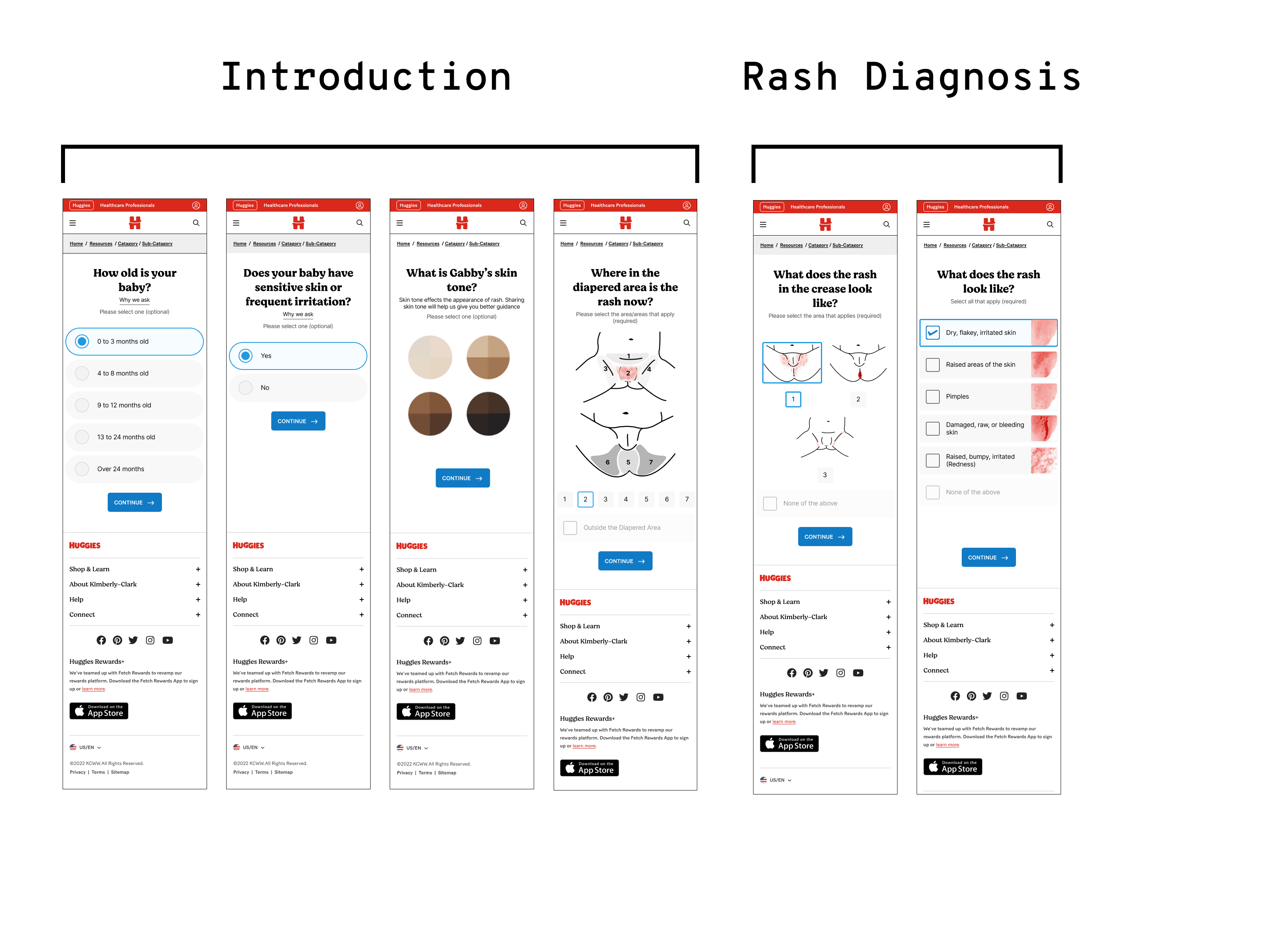
An interactive, tailored careguide tool for parents
We designed a guided tool that walks parents through visual identification, asks targeted questions, and delivers personalized recommendations with educational context.
How it works?
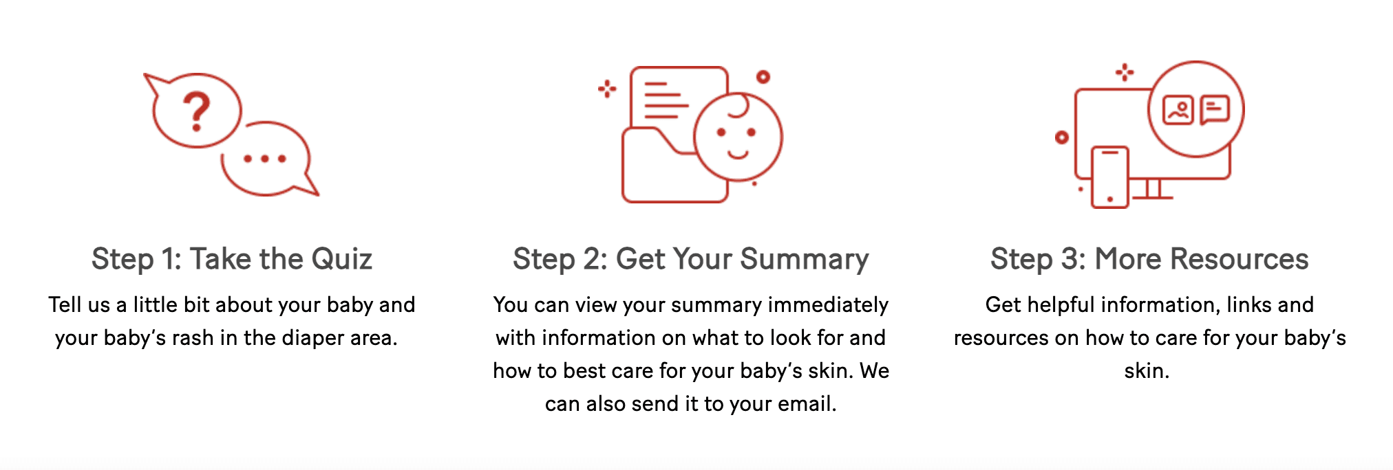
We've partnered with scientists and healthcare professionals to bring parents helpful information on checking and caring for their baby’s delicate skin in the diaper area.
BRANDING
Incorporating Huggies iconic red and white
Incorporated the design system and branding to ensure consistency across mobile and desktop.

TESTING + DESIGN ITERATIONS
Meeting our users (parent's) expectations
We conducted multiple rounds of usability testing with 45 parents, iterating on the design after each round based on what we learned.
Comprehensive Skin Tone Representation
We A/B tested showing 6 skin tones. Parents overwhelmingly preferred version 2 option, with 87% saying it made them more confident in their identification. We learned that more representation = better accuracy.

Before
After
Limited Skin Tone Options
It left some parents feeling unsure identifying themselves.
Designing With Inclusion
We added six inclusive skin tone options, expert-reviewed for accuracy.
Recognition > Second-Guessing
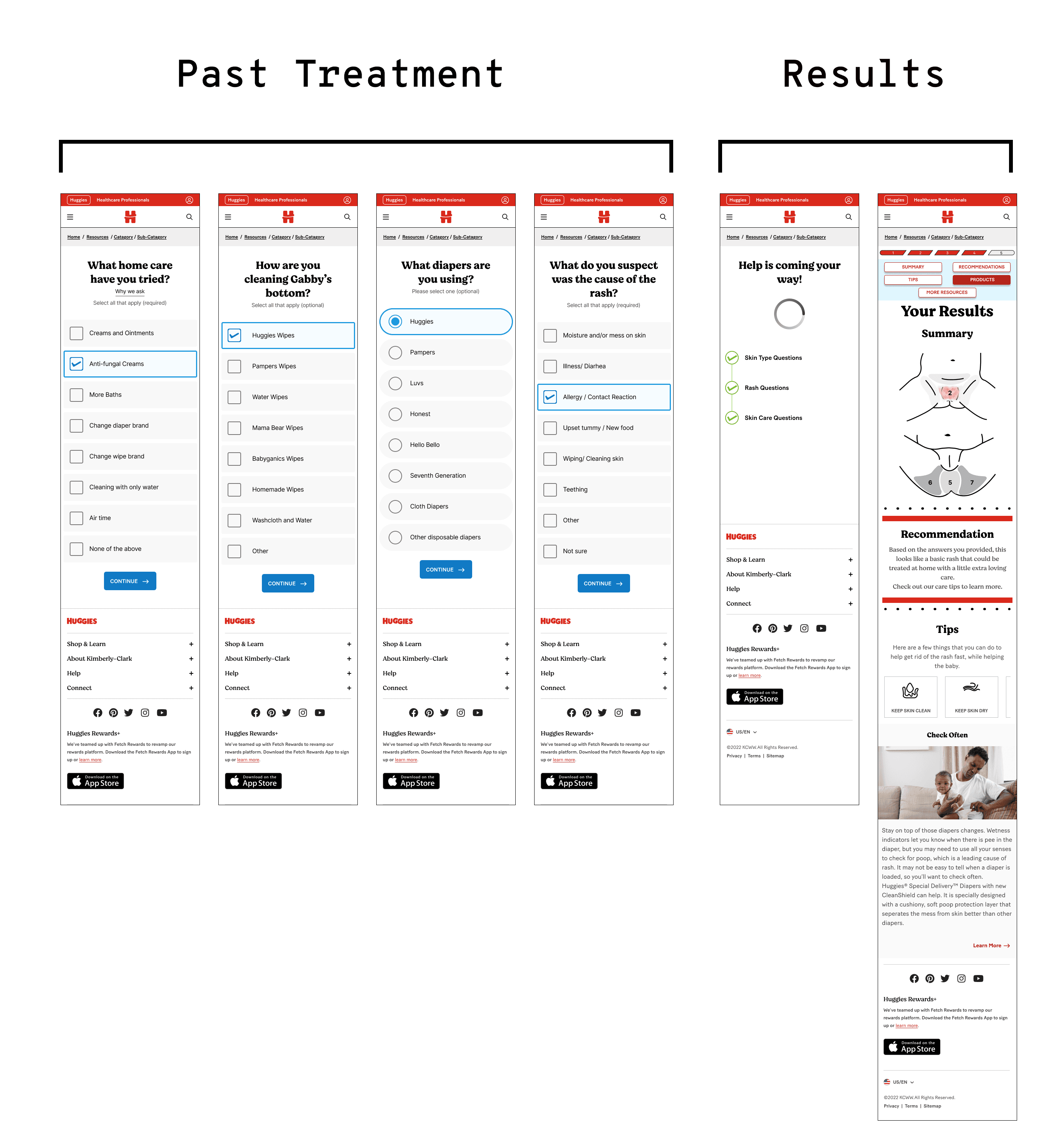
We tested adding text descriptions alongside images and found that photos alone supported clearer identification, while text alone led to confusion and second-guessing.

Before
After
Text alone does not enough provide context
It relied on broad, hard-to-interpret text descriptions.
Lead with clear visuals, support with context
It paired clearer descriptions with realistic visuals for quicker recognition.
Building A Comprehensive Results/Summary Page
We tested three result page formats. Parents wanted more than product recommendations. They needed context about severity level, summary of results, and the ability to change their answers instead of restarting the entire process.

Before
After
Summary Page Left Users With More Questions
Parents felt uncertain about severity, meaning, and next steps.
Providing Clarity, Context,and Control
The final result page provided clear severity levels, a plain-language summary of findings, and the ability to revise answers without restarting. This gave parents context, flexibility, and confidence to move forward.
Visual Design
Final Screens
Applied the final touch based on user feedback.
RELFECTION + IMPACT
— Laying The Groundwork For Future Research & Iterations
This project was part of a broader effort at Huggies. While I later left the team before it shipped , I helped lay the pilot research foundation and design direction for the end-to-end experience.
— Establishing Trust Without Bias
By carefully balancing business needs and parent inclusivity, I helped design guidance that stepped away from product promotion while strengthening trust in the brand.
— Designing When Clarity Matters Most
In moments of stress, I focused on providing clarity and reassurance by using inclusive, visual-first design. This approach reduced parent uncertainty for trusted, scalable experiences.