KCC Universal Design System for Global Brands

KCC Universal Design System for Global Brands

Design System

Branding

Documentation

Client Project

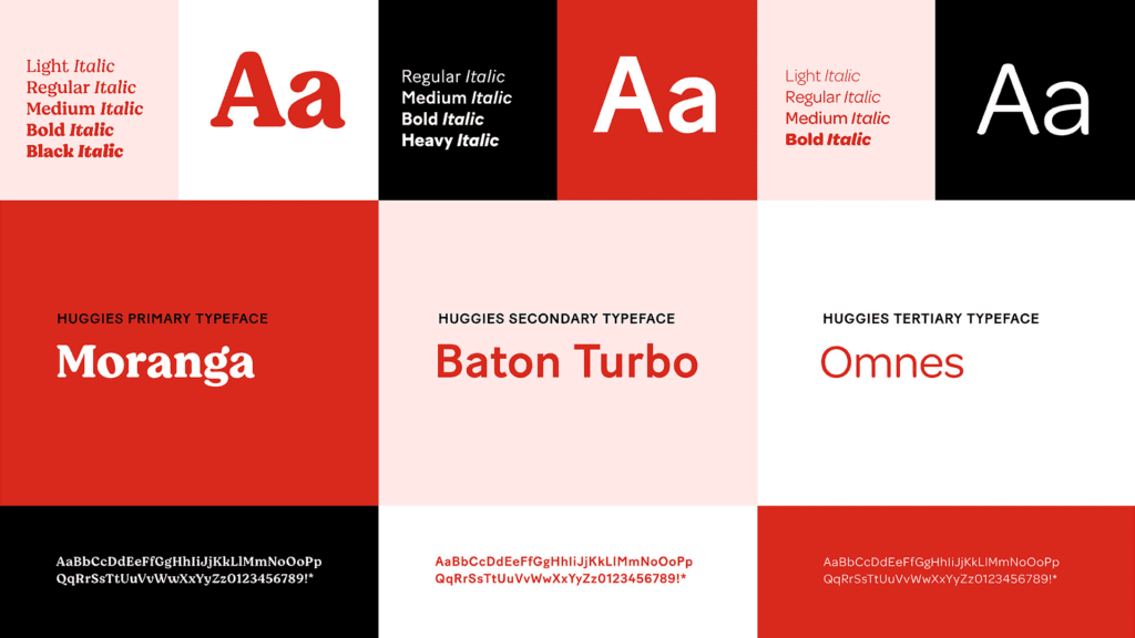
At Kimberly-Clark , I had the opportunity to work closely with designers and developers to create a unified design framework for over 12+ global brand identities. I worked on establishing and creating visual designs such as icons, graphics, typography, colors, and documentation.

Friendly reminder: Please reach out to me for the full content as I can only show the screens I worked on so far. Thank you for understanding.

The Team

Nancy (UX intern)

Xavier (UX intern)

Ethan (UX intern)

Wafa (Sr. UX Designer)

Andy (UX Manager)

Timeline

10 months, 2021-2022

Tools

Invision, Figma, FigJam, Microsoft Teams, Jira, Miro, Google Doc

Deliverables

  • Successfully transferred old designs to the Figma platform

  • Contributed to documentation and worked with developers for quality assurance

  • 83% satisfaction rate on the design system workflow

You might be asking….

You might be asking….

——————————————————————————————————————————————————————————————————————————-

——————————————————————————————————————————————————

———————————————————————

Why create a design system for multiple brands?

Why create a design system for multiple brands?

Problem

There's no clear designation for the design framework & a lot of confusion in discussions for new interns

When I first joined the KCC company, I found that there were a lot of inconsistency across the entire workflow. As a result of this, the team wasted a lot of time debating back and fourth as there was a lack of guideline and structure when we used Invision. These issues also caused confusion for new interns like myself as I was new to the design system landscape and was unfamiliar with the workflow and tool.

Revised problem statement

How might we streamline Communication and improve workflow to create a universal design system that is clear for Both new interns and existing team members to understand?

How might we streamline Communication and improve workflow to create a universal design system that is clear for Both new interns and existing team members to understand?

Proposed Solution

As a team, we ditched Invision and instead used Figma as the main platform to communicate brand values and promote collaboration across the board with developers, managers, and researchers.

As a team, we ditched Invision and instead used Figma as the main platform to communicate brand values and promote collaboration across the board with developers, managers, and researchers.

01 - Process

Have Component Organization and Structure on Figma

Using Figma as the main tool helps the team organize component categorization in it's own group. It allows us to enhance the user experience by streamlining internal workflows, enhancing collaboration with teams, and allowing designers to easily search for labeled elements by applying UX principles.

02 - Process

02 - Process

02 - Process

Clear Page Organization

I organized and labeled every page according based on what groups each label fall under.

Clear Page Organization

I organized and labeled every page according based on what groups each label fall under.

My Responsibilities

My Responsibilities

I focused on icons, colors, and typography for brands such as Huggies, Scott Toilet Paper, and More…

I focused on icons, colors, and typography for brands such as Huggies, Scott Toilet Paper, and More…

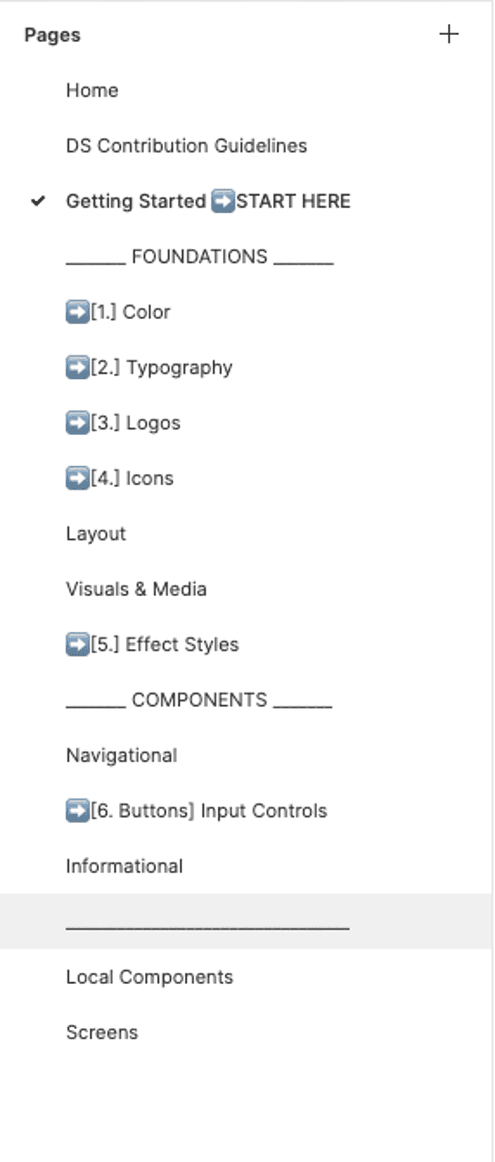
  • Created, organized, and published documentation and design components on Figma.

  • Collaborated closely with stakeholders, UX researchers, and the development team to establish Figma as the sole point of reference for internal team to check out.

  • Ensured accessibility and readability of the products and shopping services by creating guidelines and checking color contrast and typography was visible.

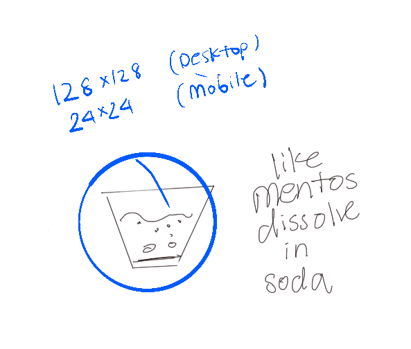
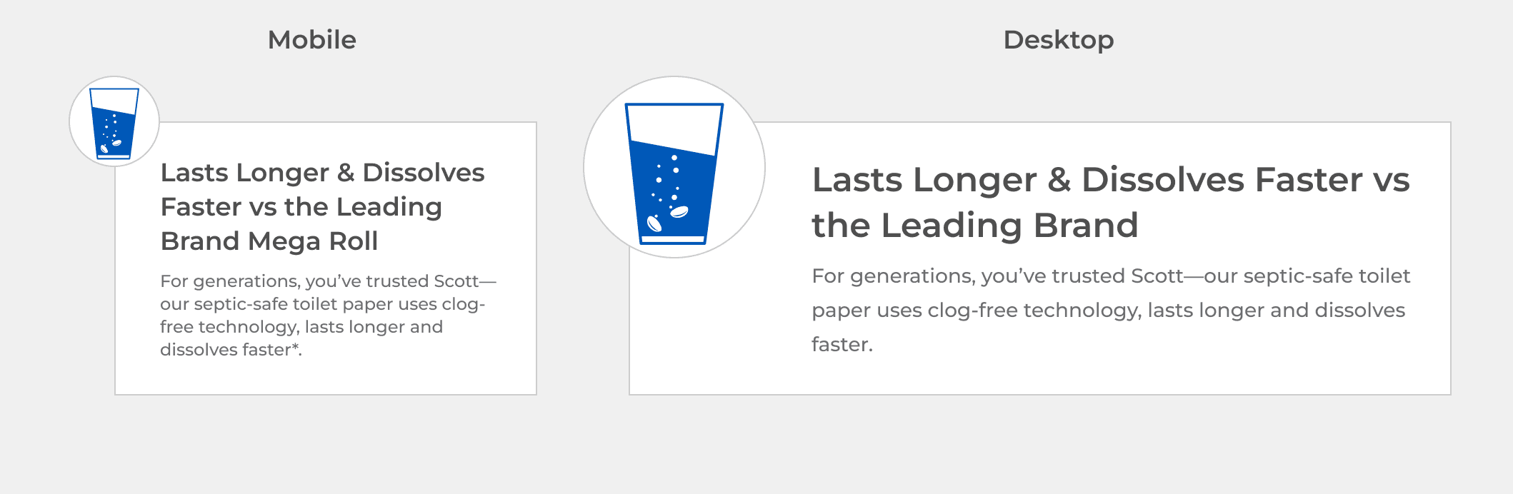
  • Partnered with the marketing team to develop standardization for designing over 25+ custom icons that align with the product description for the brands created.

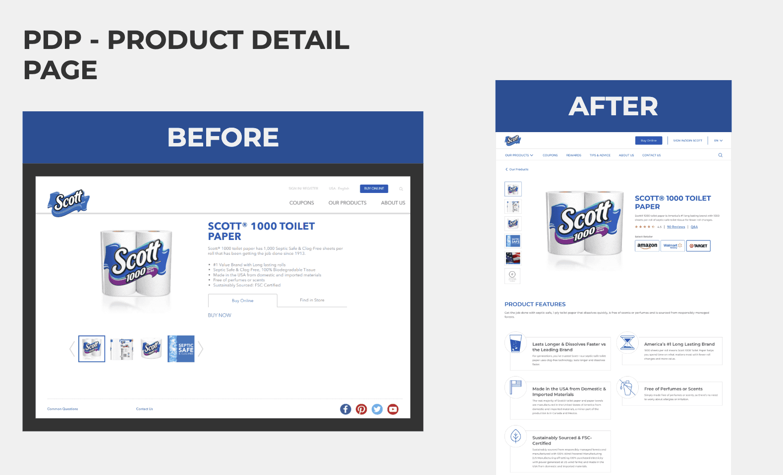
  • Designed and Iterated over 3+ unique shopping experiences and features for Scott Toilet Paper Brand.

  • Gave a seamless handoff process to the development team.

  • Inspected and double-checked website code that closely aligns with final designs.

Design system components

Design system components

I Created Design Component Visuals For Scott Toilet Paper

I Created Design Component Visuals For Scott Toilet Paper

Design system components

Design Component Visuals For Huggies

Design Component Visuals For Huggies Website

Takeaways

Takeaways

Staying detail orientated

  • Focusing on the smallest details, pixel by pixel.

  • Practicing auto-layout and stay on top of Figma update

Staying detail orientated

  • Focusing on the smallest details, pixel by pixel.

  • Practicing auto-layout and stay on top of Figma update

Next Steps

Implement design tokens

  • In the future, I would like to add design tokens for design system to reduce QA with developers.

Implement design tokens

  • In the future, I would like to add design tokens for design system to reduce QA with developers.

Get in touch with me at

nancymadesign@gmail.com